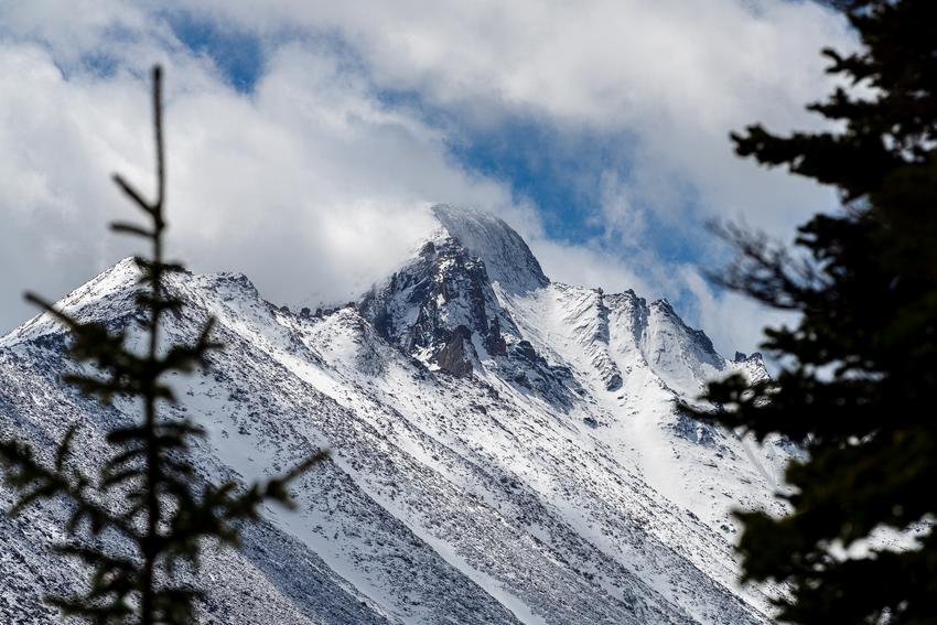
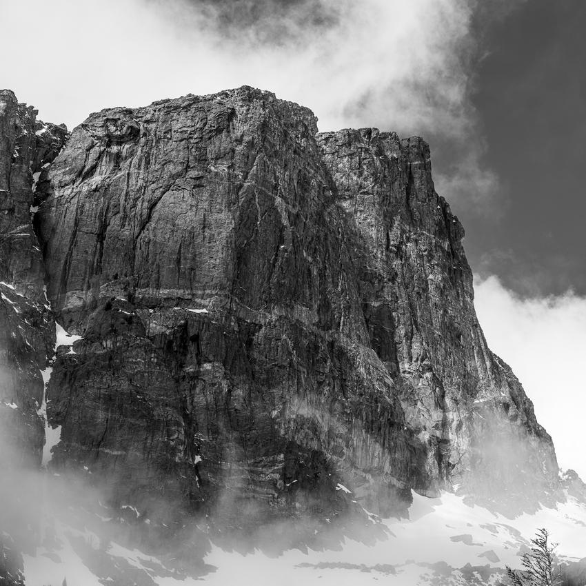
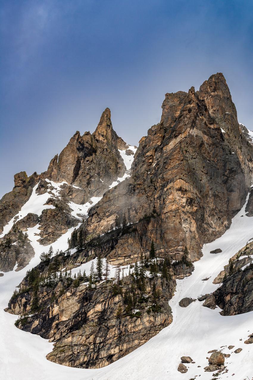
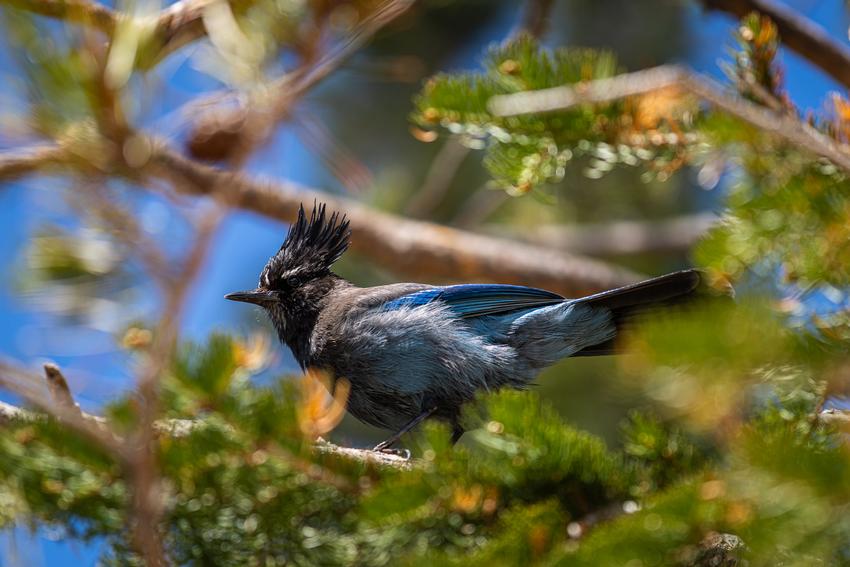
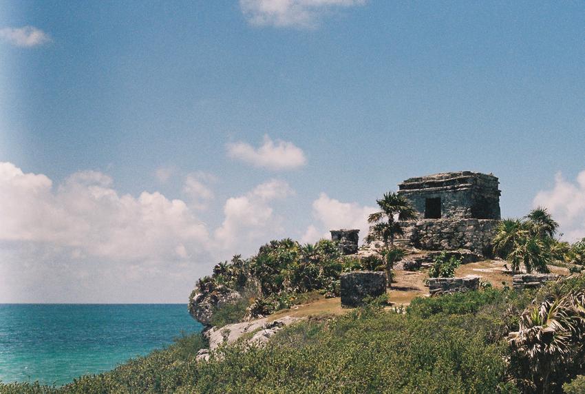
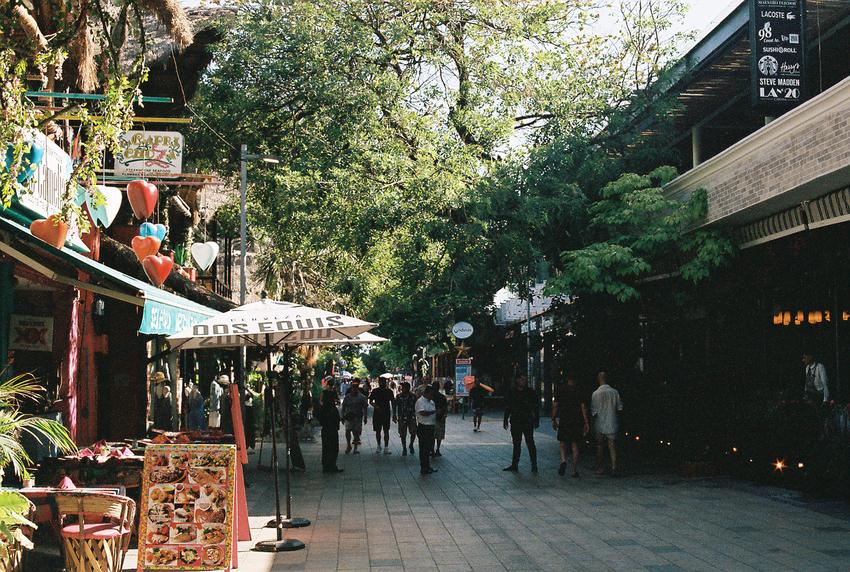
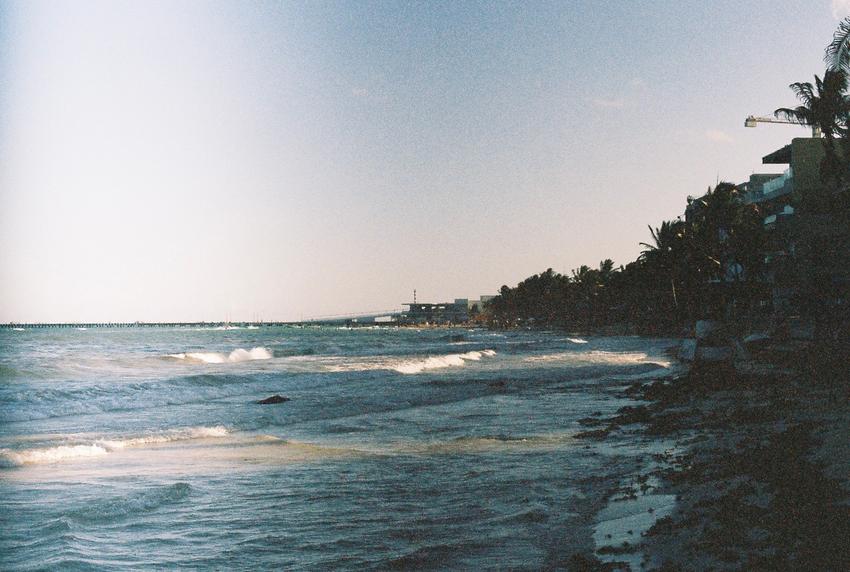
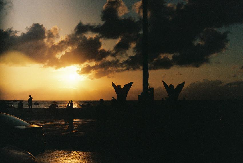
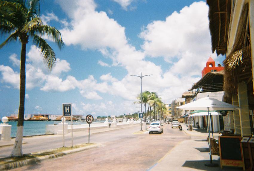
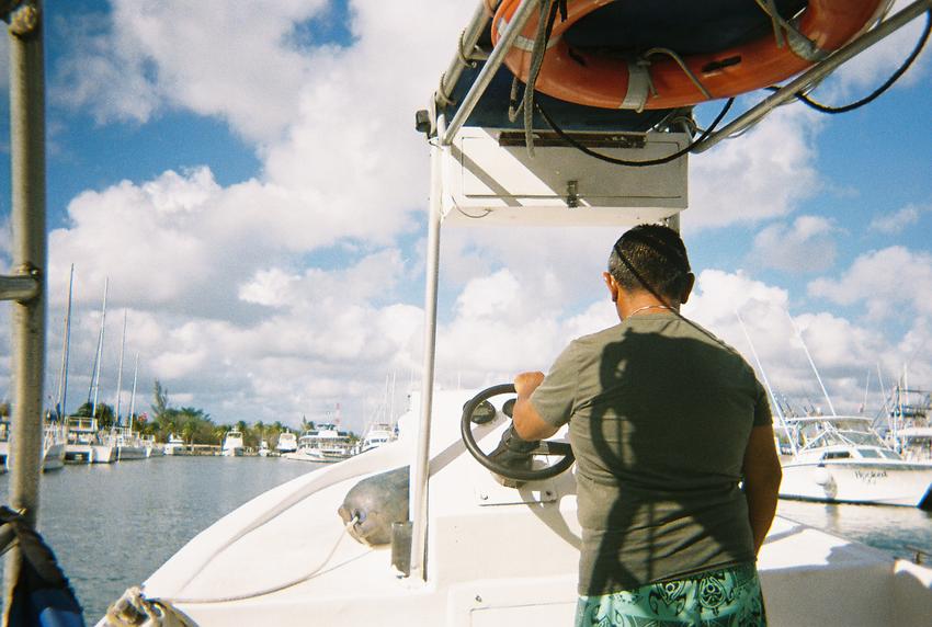
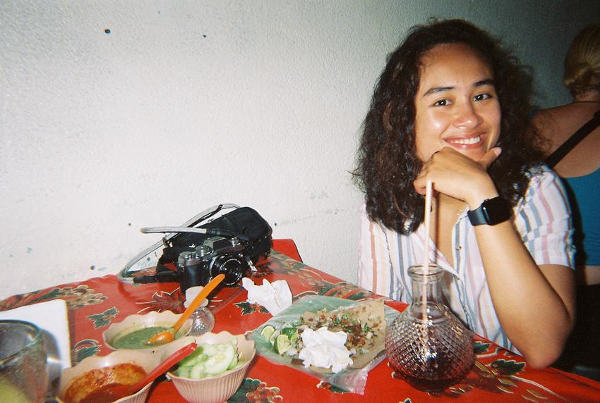
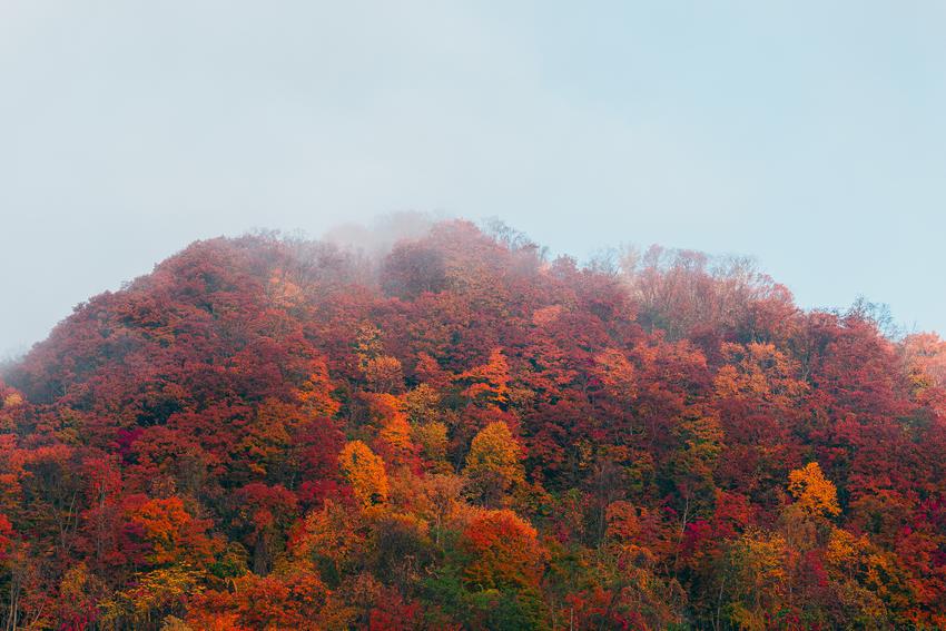
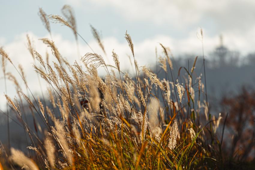
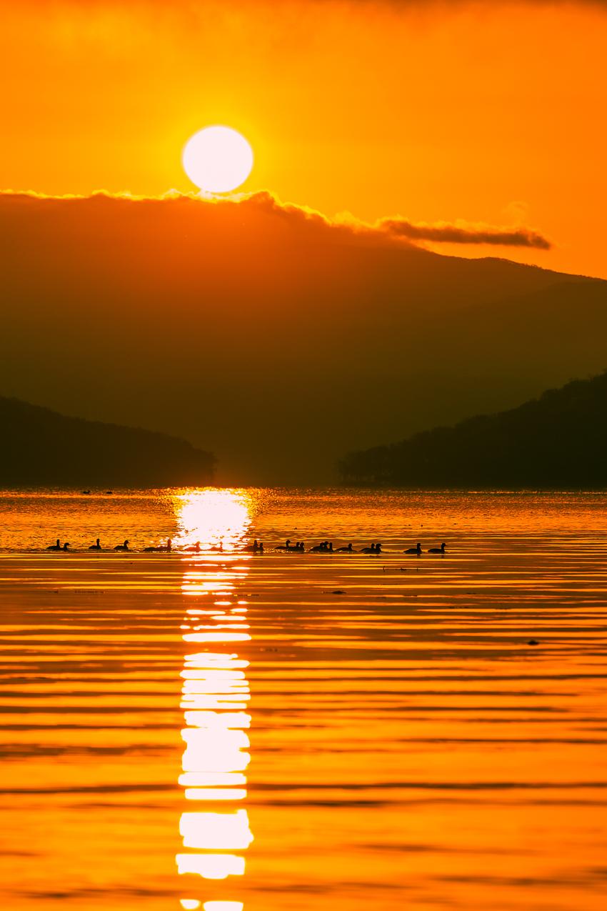
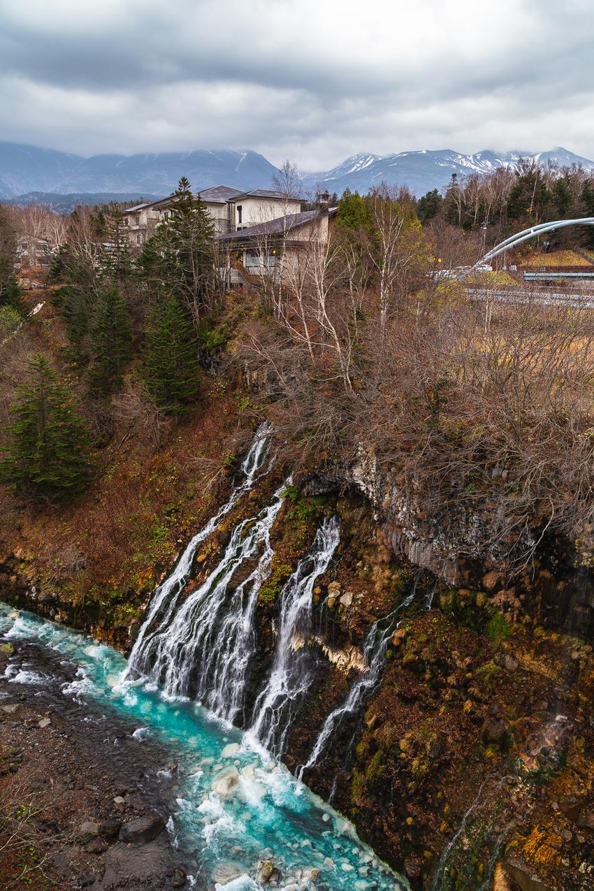
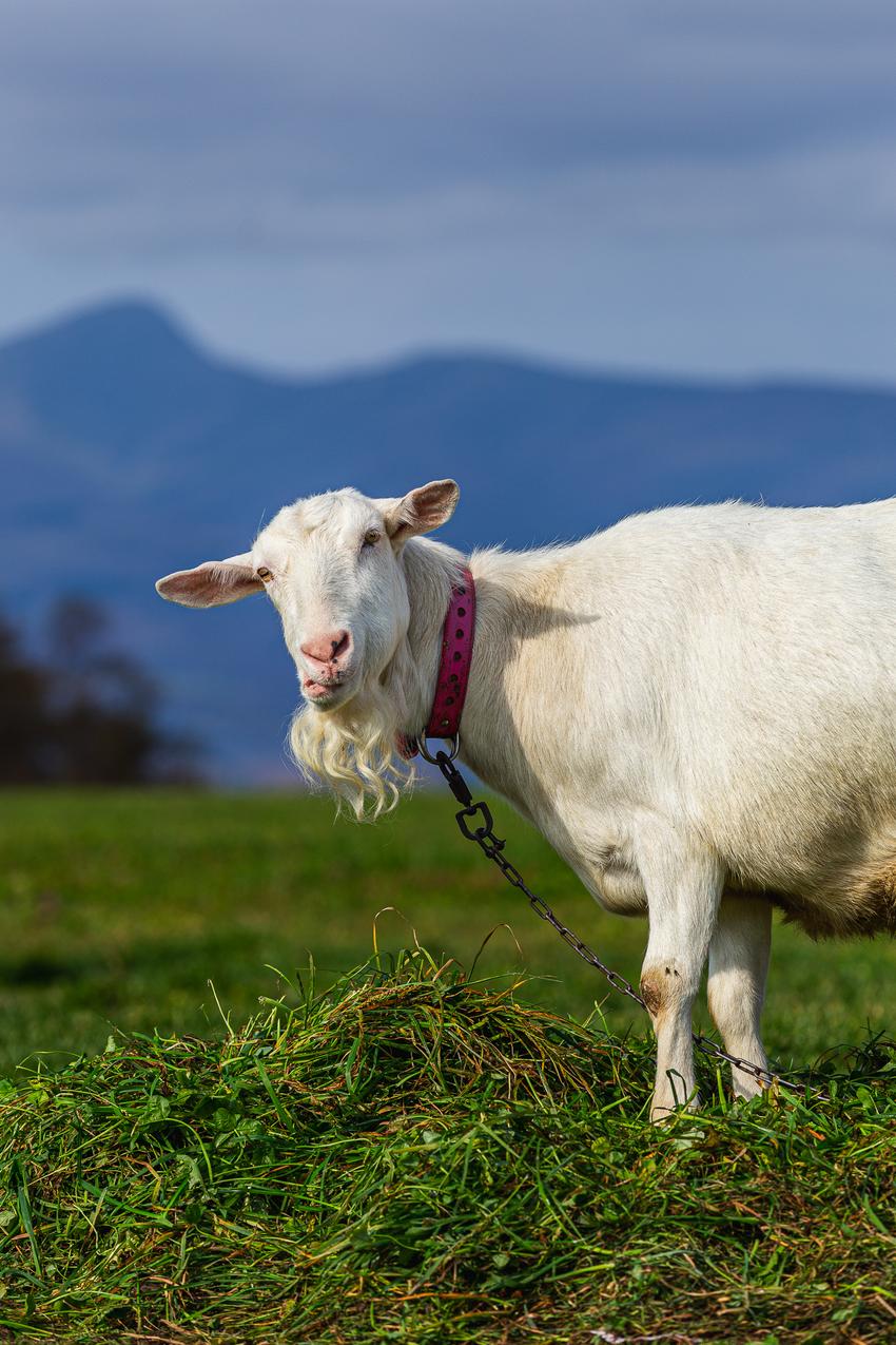
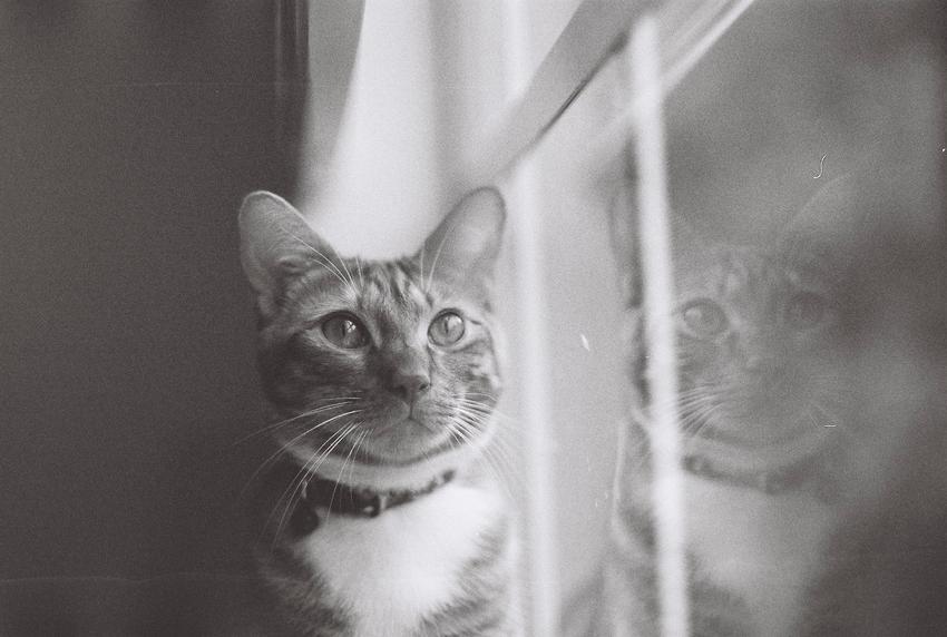
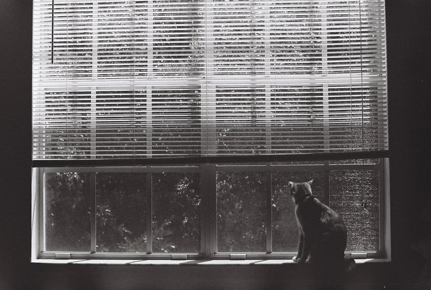
For my upcoming scuba diving trip, I didn't feel like bringing my heavy DSLR with me so I'm instead bringing my old Minolta X-370s 35mm film camera. It's been collecting dust for the past few years, but in getting it ready for the trip I found out there was still half a roll of the Ilford HP5 Plus film in it. I also found a fully exposed roll of the same film sitting in a drawer. I had no clue how long it's been sitting there.
So I took them in to get developed, looking forward to seeing what mystery photos awaited me. Though I wasn't sure if these photos were still intact since they were exposed years ago and the film had long expired.
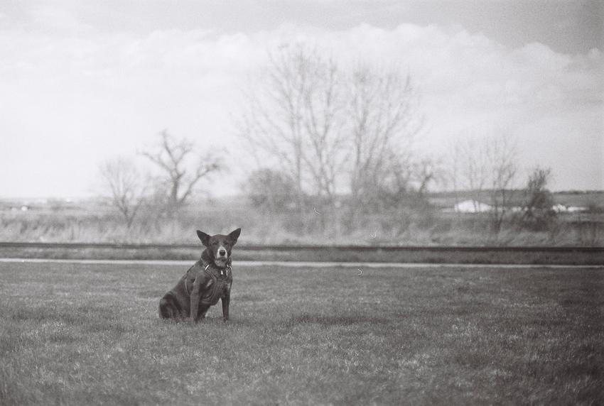
To my delight, all of them survived, albeit a little faded. It turned out these were shot around the first half of 2017 and were mostly of my cat Simba. Here are some of my favorites:
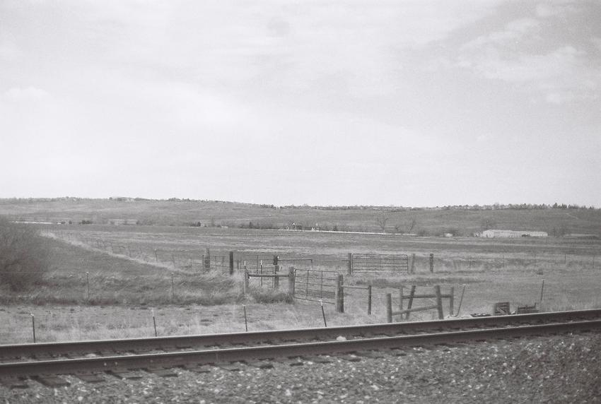
And a few I took recently from the half roll that was left in the camera:
This discovery reminded me of how much I enjoy shooting film, and now I'm even more excited to bring the camera on the trip.
Hopefully it won't take me seven years to get them developed this time.
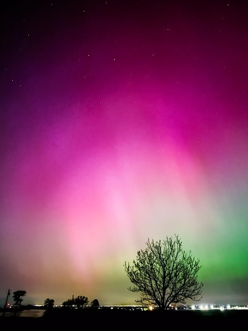
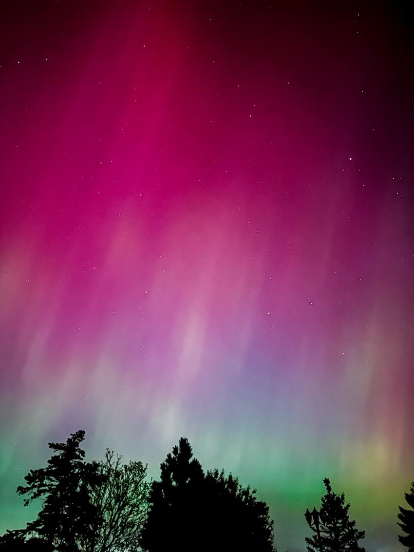
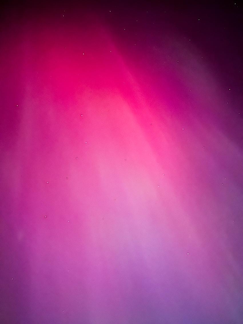
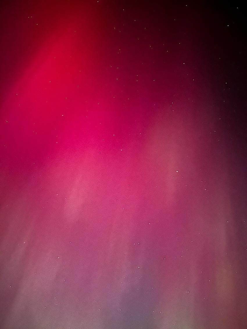
As you almost certainly have heard and seen countless photos of at this point, there is a huge solar storm bombarding earth right now, which gave millions of people spectacular shows of northern lights last night. Not wanting to miss out on this, I drove north of the city away from light pollution and was treated with a stunning display. This was the first time both Jess and I had seen auroras. It was so surreal we couldn't believe our eyes.
Last Updated: 6 August 2024 (after my trip back to Krabi in July)
Recently I've had occasions to offer recommendations to a few people visiting Krabi for the first time. I've just been passing along a private note with this list of places, but I figured I should share that here.
One disclaimer though: while I like to call these my local recommendations since I grew up there, I haven't lived in Krabi since 2010 and a lot has changed since then. I still visit every couple of years and like to try new places locals go to. So I've been to most of these many times throughout my childhood and on recent visits, and the rest are recommendations from family and friends who currently live in Krabi.
I've also created a Google Maps list with all these for your convenience.
Food
Starting with the most important category. Most of these are located in or near Krabi town as I don't have much experience with food places near those popular tourist destinations like Koh Phi Phi or Ao Nang.
My personal favorite. It's where I go for my first meal whenever I visit (you’ll also likely run into me here a couple days a week).
Very local spot. I don't remember ever seeing tourists here.
Go only if you’re feeling adventurous as it's not a tourist-friendly restaurant. They have no English menu, and the staff doesn't speak any English. But they make the best southern Thai food in town.
My order: Pork ribs curry, crispy pork, tom yum gung, gaeng som, tom jik ko, steamed eggs
This place may look like they only sell noodles but the must-try dish is the baked chicken rice. Incredibly tender and addictively delicious. I've been going there since I was a kid and that's the dish I always get.
Street food carts in a parking lot going late into the night.
If you’re lucky, a local legend เจ๊ไหม (Jae Mai) with her homemade coconut milk ice cream cart will be there. Make sure to not miss this. Get one with everything on it: bread, corn, and “look chit” (palm seed boiled in syrup).
After a long winter break, it's finally race week! Inspired by The Backmarkers podcast, I figured I'd write down my predictions for the F1 2024 season to see how many of these I get right by the end of the year.
If you follow the sport, you'll know a couple of these predictions are unlikely to happen. But obviously I am biased, and those are more of my wishcasting than anything.
Max wins drivers' championship with fewer than four races remaining. He doesn't win as many races as he did last year. There are three other race winners besides him.
Red Bull wins constructors' championship at the Austin Grand Prix. Mercedes comes in second and the point gap to Red Bull is smaller than last year.
Lewis wins a race with Mercedes one last time at the São Paulo Grand Prix.
Lando wins his maiden Grand Prix (it's long overdue).
RB1 finishes higher in constructors' championship than last year.
Yuki gets his maiden podium, and outscores Daniel at the end of the season.
Alex gets a podium (by some miracle).
Carlos outscores Charles.
Logan loses his seat at Williams.
Alex gets the Mercedes seat.
Checo loses his Red Bull seat and Carlos gets it.
After the investigation, Christian Horner remains Red Bull team principal and only gets a slap on the wrist2.
We'll find out about this tomorrow. I won't be surprised if the allegations are proven to be true. But I can't imagine Red Bull sacking him, as much as I'd love to see that happen. ↩︎
Over the past couple of weeks, there have already been enough takes on the Apple Vision Pro and the internet clearly does not need another one from somebody like me. Still, I just wanted to jot down some thoughts and observations from my personal experience—for my own records, if anything.
This was the first Apple product that I was there for on launch day and that was a really fun experience. You could tell the retail employees and everyone in line were super excited. I had an 8am pick-up appointment and was second in line. I opted to do the demo to see what that experience was like and to also make sure I had the right fit.
The very first thing I noticed and was honestly a bit disappointed by was that I could clearly see outside light leaking through the gap around my nose. Perhaps this is by design. Or perhaps it’s due to my Asian descent with my low nose bridge. I heard quite a few people complaining about discomfort on their nose as the weight of the headset presses down on it. I don’t have that issue at all and I can easily slide my thumb through that gap. I wish this little black nose cloth was a bit bigger, or customizable to fit people with different nose shapes and sizes.
The field of view leaves a lot of be desired. The simulated view from The Verge’s review is very accurate. Some say it’s like looking through ski goggles but I can see quite a bit more through my ski goggles. Maybe I need to get a different light seal that puts my eyes closer to the screens.
But that would make another issue worse. I use prescription inserts and my eyelashes would sometimes brush up against them. So after a few hours of use, there are some noticeable smudges that I’d need to take them off and clean them. I don’t think my eyelashes are longer than average. Maybe my eyes are already too close to the lenses. Or maybe I just have oily eyelashes.
I struggled a bit at first to do the initial calibration. I would look at a dot and as I did the pinching gesture I was already moving my gaze over to the next dot. And so it ended up not registering it or hitting the wrong one. This is also the case with other interactions inside visionOS. I needed to learn to not look away too quickly when I’m trying to interact with something.
This leads to quite a few accidental inputs and that can get really frustrating fast. But I think the eye tracking itself is not as accurate as I was expecting. Sometimes I really have to look hard or re-look at something for it to get highlighted. Sometimes it just doesn’t register where I look correctly and I have to look slightly outside of what I want to look at to interact with it. This is especially frustrating when using iPad apps where elements are much closer to each other, and some apps are downright unusable. For example with Discord, none of the interactive elements has a hover state so I just have to look, pinch, and hope that I looked hard enough at the element I wanted to select.
The pinching gesture itself feels very intuitive, though I sometimes find myself having to exaggerate the pinch gesture a bit for it to be recognized. One realization I had about using the Vision Pro that is not true for other electronic devices is that I can use it while snacking and my hands are dirty. It’s quite a freeing experience, really.
The passthrough view is decent. It’s good enough that I frequently just walk around the house and do things like normal. But it’s too fuzzy for me to be able to use my phone or read a book.
Speaking of using my phone, obviously Face ID doesn’t recognize my face while wearing the headset so I have to type in my passcode. But I don’t see why it can’t just unlock my phone while I’m currently authenticated on my Vision Pro, similar to Apple Watch unlock. Hopefully this is something that will be added in a future OS update.
Optic ID is really convenient and feels magical. Unlike Face ID, I literally don’t have to do anything while it’s authenticating my eyes. It just works every single time.
My Persona is quite uncanny and makes me a bit uncomfortable at first. The hair is just a solid blob. But I’m really impressed at how much it’s able to pick up on my facial expression. My eyes, eyebrows, nose, cheeks, lips and tongue movements all pretty much come through accurately. I do wish that they allow for multiple Personas though.
The windows in visionOS are quite a bit bigger in space than I was expecting. They do take up a lot of space in your field of view. Also moving them closer or further away doesn’t actually change how much field of view it takes up. It feels a bit like an optical illusion. I know it’s not what’s happening here but this does make me think of the dolly zoom effect.
Mac Virtual Display is a really useful feature. I know it’s not close to the Studio Display quality but my Mac screen looks perfectly sharp in visionOS and I could use it just fine. I was on a FaceTime call with a friend and they were sharing their screen and so I had two virtual Mac screens in my space at the same time that I can place wherever. I thought that was super cool.
Text input is just unusable and get really frustrating. I’m writing this entire post with the Vision Pro using Runestone with a connected Bluetooth keyboard. Even then, there’s always a little window that pops up in your view and doesn’t go away during text entry.
Watching movies should be done in an environment. In a regular app window the corners are way too rounded, cutting off too much of the content. These turn into appropriate right-angle corners in immersive mode. Plus, the “light” from the content interacts with the environment it’s in. You can see it reflected on the lake at Mount Hood, off of rocks on the moon, and on the snow at Yosemite. I was so blown away by this.
I can definitely feel some eye fatigue after using it for a few hours and have to force myself to take a break. Taking it off after a long session does feel quite relieving, not too dissimilar to when I take off my contacts after a long day.
It might sound like I’m unhappy with this device. It is extremely expensive. And I was actually on the fence whether I should return it but I ended up keeping it. It’s far from perfect but I’m really excited about its prospect and to see where this goes next.
I'm thrilled to announce a major update to my space launch schedule app, Liftoff!
The app was initially released in 2016 and was due for a facelift. Since the summer of 2021, I've been slowly and intermittently working on a complete SwiftUI rewrite to bring in a fresher look and introduce new features.
In Liftoff 2, you can now easily switch between recent and upcoming launches. Every launch in the list now contains a badge indicating the current status and whether a webcast is live.
The details page now showcases images of both the launch vehicle and mission badge. You can also dive deeper into launch vehicle, launch provider, and mission details including mission type and target orbit. The new weather forecast feature helps you stay informed of the condition at the launch pad. Plus, a convenient home screen widget displays a countdown to the next launch.
The most significant addition is the enhanced search page which now highlights frequent launch vehicles, active spacecraft, space agencies, and astronauts currently in space. The search capability provides a way to find more information on them as well as a glimpse into the rich history of space exploration, spanning back to its early days.
Liftoff 2 is also set to launch alongside the Apple Vision Pro tomorrow! While there's nothing too drastically different with the visionOS version, the platform does enable you to have launch videos floating right next to the app, making for a more immersive launch viewing experience. More exciting features are forthcoming on this platform, so stay tuned.
This app wouldn't be possible without the fantastic team at The Space Devs who developed and maintain an incredibly data-rich and up-to-date API for space nerds like myself to use, all for free. A massive Saturn V-sized thank you to the amazingly talented Michael Flarup for thoughtfully crafting such an impeccable icon that not only brought my idea to life perfectly but far exceeded my expectations. I'm glad to finally be rid of that old icon I used for way too long. Also, to the small group of beta testers who provided valuable feedback and bug reports along the way, thank you.
I was just reminded of this video I put together for a dive trip I went on with my friend Indira back in 2016, and it got me thinking about sharing it here along with some quick thoughts.
The highlight of the trip was undoubtedly the USS Spiegel Grove wreck. Exploring the ship's eerie interiors was absolutely exhilarating and I wished I could stay down there longer than I did. I'm so excited to go scuba diving again later this year.
One fun tidbit about this video was that I put it all together on the iPhone 7 using iMovie. I had just gotten mine after the trip and wanted to see how it handled processing a bunch of 1080p/60fps video footage and editing them. I don't remember having any issues with it other than the screen being quite small. But I think the video turned out pretty good!
Inspired by Rebecca Owen's post and over 130 others from the community as of this writing, I am also joining the trend of sharing my current default apps list. I've done something similar back in 2017 with my checklist of apps and configurations when starting fresh on a new Mac, and my Uses page also contains a smaller list of software. But this will be a more complete and up-to-date list at the time of this publication.
As far as I understand, the initial intent of this from the Hemispheric Views podcast episode (which admittedly I haven't listened to) was to look at how many of these categories are the built-in default apps that come with the OS such as Apple Mail, Notes, Reminders, etc. But it seems like this has evolved quite a bit and people have thrown in their own categories that may not have platform default counterparts. So I'm separating them into main categories and a list of additional ones of my own.
Since we moved to Colorado, I had this goal to one day hike one of the state's numerous fourteeners. Jess and I go hiking often around here, but we'd never attempted one of these. The closest one to us is Mount Bierstadt which is considered one of the easiest fourteeners to climb. From the Denver metro area, it only takes about an hour and a half to drive there. Due to that, this is probably the most visited fourteener in the state.
So that's what we set out to climb a few weekends ago. We planned be at the trailhead by 5am to make sure we got one of those coveted parking spots as we didn't want to hike any longer than we needed to. The trail starts near Guanella Pass at almost 11,700 ft (3,566 m) and climbs about 2,700 ft (820 m) to the summit at 14,065 ft (4,287 m). According to AllTrails, the out-and-back length of this trail is 7.2 mi (11.6 km) and should take around 3-5 hours to complete.
We knew that it would take us longer than average for a hike like this, probably closer to 6-7 hours. So we planned to start around 5am and be back down by noon-ish and get lunch afterward. With this being the biggest hike either of us had ever attempted, we weren't sure if we would make it to the summit. I gave us about a 50/50 chance of making it up there.
Coincidentally, I had just bought the new Apple Watch Ultra 2 a couple of days before we went on this hike, so this was the perfect testing ground for it. I also had just recently learned of this beautifully-designed indie app called Landscape that was made specifically for a hike like this. So I was looking forward to trying it out.
The temperature was right around freezing when we got there and we came prepared with plenty of warm layers and headlamps. Including food and water plus the camera gear, my pack probably weighed close to 15lbs. The parking lot was already filling up but we got a spot. From there we could barely see a faint silhouette of the imposing mountain with a field of stars in the backdrop. I thought it looked quite intimidating. A scattered trail of flashlights from people who started even earlier than us could be seen snaking up the mountain.
We hit the trail at 5:30am and the first mile or so was pleasant as it was mostly flat, and even downhill a bit. The second mile was when the switchbacks began and the trail started to climb with tall bushes flanking us. It was a gradual incline but we made sure to go slow to not tire ourselves out.
It was an early fall day without a single cloud in the sky. And of course, the sunrise was magnificent.
It's almost 8am and we had been hiking for about two and a half hours. We still had about 1.5 miles and 1,500 feet to go. We were well above the bushes now and the landscape became a lot more rocky with little vegetation. But up in this environment was where we saw some cute wildlife to distract us from the physical exertion.
It's 10:30am, five hours after we set off. We were tantalizingly close, just over 300 feet of elevation to go. The effective oxygen at this altitude is a little above 12%.
As you can see from the photo above, the last bit of this was a scramble up a boulder field. It was a kicker for us but we pushed through. And after nearly seven hours, we finally made it to the summit!
We spent less than an hour at the top. There was a big group up there with us and they were quite loud. Plus it had taken us much longer than planned to get up there, so we knew we had to get going. Looking down to the parking lot and seeing how tiny and far away it looked was incredibly discouraging for me. Getting up there really was only half the battle. I almost wished I had a glider.
But not long after we started climbing down, another distraction came our way.
It was more than just a single distraction. We got a herd of them.
I spent way too long taking way too many photos of these mountain goats. But they made the extra work carrying the heavy camera gear up the mountain all worth it.
The next few hours were not at all enjoyable. It wasn't as physically demanding as going up in terms of cardio effort, but our legs and knees hurt from stepping down on these rocks that seemed to just go on forever. Plus we were hungry as we only packed enough food for breakfast and light lunch.
After what felt like an eternity, we eventually made it to the car at 5:30pm, four and a half hours since we left the summit, and exactly twelve hours since we started. There was almost nobody left on the trail or in the parking lot. Looking back at the peak, I couldn't fathom how we made it up there to begin with. The hike up felt like a distant memory or a fever dream. It didn't feel like it really happened. We were that exhausted. We didn't get back home until 7:30pm, sixteen hours after we left that morning.
As for my new Apple Watch Ultra 2, I ended up draining its battery more than I expected as it had about 10% left when we got back home. It was running both AllTrails and Landscape the entire time and I didn't enable low power mode on it. My old Apple Watch Series 6 would have died not halfway up the mountain. My phone was also running AllTrails all day and it died halfway down the mountain.
In hindsight, what we really should have done was to take note of our pace on the way up, and figured that it was going to take us way too long to complete the hike. That was a rookie mistake that we'll be sure to not make again. We should have turned around when we saw that it's been over two hours and we were barely halfway up. We were lucky we went there in the fall. Had we gone in the middle of the summer, we would surely have been hit by afternoon thunderstorms. And with the lack of any tree cover on this trail, we would have been in trouble. Also, it's always a good idea to pack more high-calorie food and snacks than you think you'll need.
Sitting here now in the comfort of my home, I'm glad that we went on this hike, even though it turned out to be more of an adventure than we were prepared for. I know I'll attempt more of these in the future.
I've been closely following WWDCs and their announcements for at least ten years now. And every year I wish I could visit the conference in person, but due to various reasons I never made it happen. Well, this year is going to be different as I will be traveling to Cupertino for the WWDC23 week!
Though unfortunately I was not one of those lucky few who got the golden tickets to Apple Park (maybe next year 🤞), I figured it would still be fun to go meet fellow Apple nerds and join in on all the communities events happening that week in the area. So far I know I'll be attending RevenueCat's pre-WWDC Barcade Bash, iOSDevHappyHour, and perhaps the Dub Dub Climb.
Before we get to all that fun, as per tradition, here is my wish list for updates and announcements:
VR/AR Headset
All the reports around this have picked up so much in recent months that I think we'll really see it this year. At this point, it would be the biggest story of the week if Apple did not announce the long-awaited headset. I am for sure excited to see this finally, but sitting here right now I honestly don't exactly know why I would want one. The only experience I have with VR headsets is the original Oculus Quest, and that was mostly just for gaming. And we know how Apple is with gaming. What I'm expecting is for Apple to wow us in this regard like they did many times before when they introduced new product categories and give us compelling reasons why we might want one.
The rumored price tag of up to US$3,000 is unfathomably high and I will almost certainly not get one if that ended up being accurate. Perhaps we will be pleasantly surprised like with the original iPad where the actual price was half of what was rumored at the time.
iPhone Security Issue
If you've been following Apple-related news at all, you would have surely come across this bombshell report from WSJ of how thieves shoulder surf for people's iPhone passcodes before stealing them. And with just the passcode, they were able to change the Apple ID password and effectively locking the owners out of their iCloud accounts.
The implication of this goes deep and can really mess up more than just your digital life. Not only would thieves get access to all your iCloud stuff (photos, email, files, etc.), but if you also use the built-in password manager, the thieves could gain access to your bank account and other sensitive information. They really should not let people change the Apple ID password just by using the iPhone passcode. The chain is only as strong as its weakest link, and a 6-digit passcode is too weak for something as important as the iCloud account. I know that people forget their Apple ID passwords all the time and I can kind of get why Apple decided that it is worth the risk to make it easier for those people to gain back access to their accounts. But I think the risk here is too great.
I do hope they address this flaw in the system and come up with a mechanism to make this less likely to happen. For now given how we do so much on our phones, we would be better off switching to an alphanumeric password and treating typing it in on our phones as a sensitive operation, like for ATM PIN or bank account password, so that people can't easily shoulder surf for it.
Apple Music and Music App for macOS
Apple Music the service and Music.app on macOS are in dire need of some big improvements. The macOS app is just overall a terrible app (iOS app isn't much better either): songs would refuse to play for no apparent reason, navigation is incredibly slow and clunky, searching feels broken and slow. For the Apple Music service itself, it needs to improve on the recommendation algorithms, playlist curation, and just the overall stability and reliability of the service. I think it fails to meet some basic baseline-level features that its biggest competitor, Spotify, has been doing so well for years. Having said all that, with the recent release of Apple Music Classical, I am not holding my breath that they will do much, if anything at all, about this.
Safari Tab Groups Improvements
I really want to use this feature more as I always have so many Safari tabs and windows open at any given time. But the most annoying issue with this for me is the fact that if I am actively browsing using a specific tab group, opening a link from another app will always open it using a non-tab group window. I just want a way to control where I want links to be opened in. I have countless times run into this and then had to move that tab over to the tab group window I want. In the end I just gave up and stopped using tab groups entirely. I know that you can associate a Focus with a tab group and make external links open in that tab group, but I have a lot of tab groups and they don't nicely map one-to-one with Focus modes I have.
Home App and HomeKit
One thing about HomeKit that I would like to see is the ability to create more complex conditionals for automations. Right now automations are still based on simple and limited set of triggers, but I would very much like to be able to create conditionals to perform certain automations. For example: if the humidity is below 30% and somebody is home, turn on the humidifier, except between 10pm and 8am.
And strangely the Home app still doesn't have Home Screen widgets. I hope to see these in iOS 17.
Lightning Round
Something needs to be done with Siri with how terrible and unreliable it is. I want to see some meaningful and substantial changes to it this year.
The Photos app does a pretty good job with facial recognition for people. But unlike Google Photos, it still does not recognize pets. I just want to assign names to photos of my pets.
The Apple Silicon Mac Pro is still a thing right? It's been well over a year since John Ternus teased us that it's coming. I believe.
I find Spotlight on iOS really useful and frequently utilize it for things like unit/currency conversions or dictionary. But what's missing for me is the ability to quickly translate words (or maybe even sentences) to another language. I want to just type in "Tuberculosis in Thai" and get an answer that way. Plus now that iOS comes with Translate app, I don't see why they can't do this.
The workout streaks should not have to be every day. Give us the ability to define weekly streaks for workouts.